

I asked an AI tool to create a slide deck introducing the idea of tech writers becoming “context designers.” It took only a few seconds to produce something that looked completely presentable.
There was an agenda, several bullet-heavy slides, a comparison table, a few icons, and the familiar blue background that seems to accompany many enterprise software slide decks.
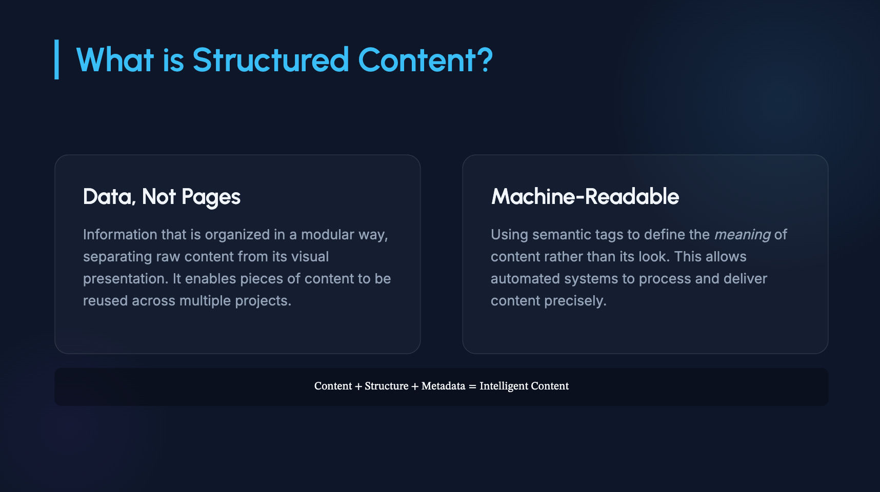
There wasn’t anything obviously wrong with the slides it generated. If someone had shown it during a conference presentation, I doubt anyone in the audience would’ve complained.
At the same time, I couldn’t point to a single slide that helped me make sense of the topic. The deck looked like a presentation because the AI tool had learned what presentations (slide decks it was trained on) typically look like. That isn’t the same thing as understanding how presentations are designed and what techniques are needed in order to communicate with slides effectively.
Why Do AI-Generated Slides Feel So Familiar?
This question set me off on a hunt for guidance from an old school resource. My bookshelf, which housed several works from two communication design influencers.
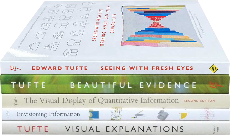
Edward Tufte hardly needs an introduction for many readers of The Content Wrangler. But for the uninformed, he’s Professor Emeritus in Political Science, Computer Science & Statistics at Yale University. His books, especially The Visual Display of Quantitative Information, Envisioning Information, and Beautiful Evidence, shaped the way generations of technical illustrators, information designers, and technical communicators think about charts, diagrams, comparison, and evidence.
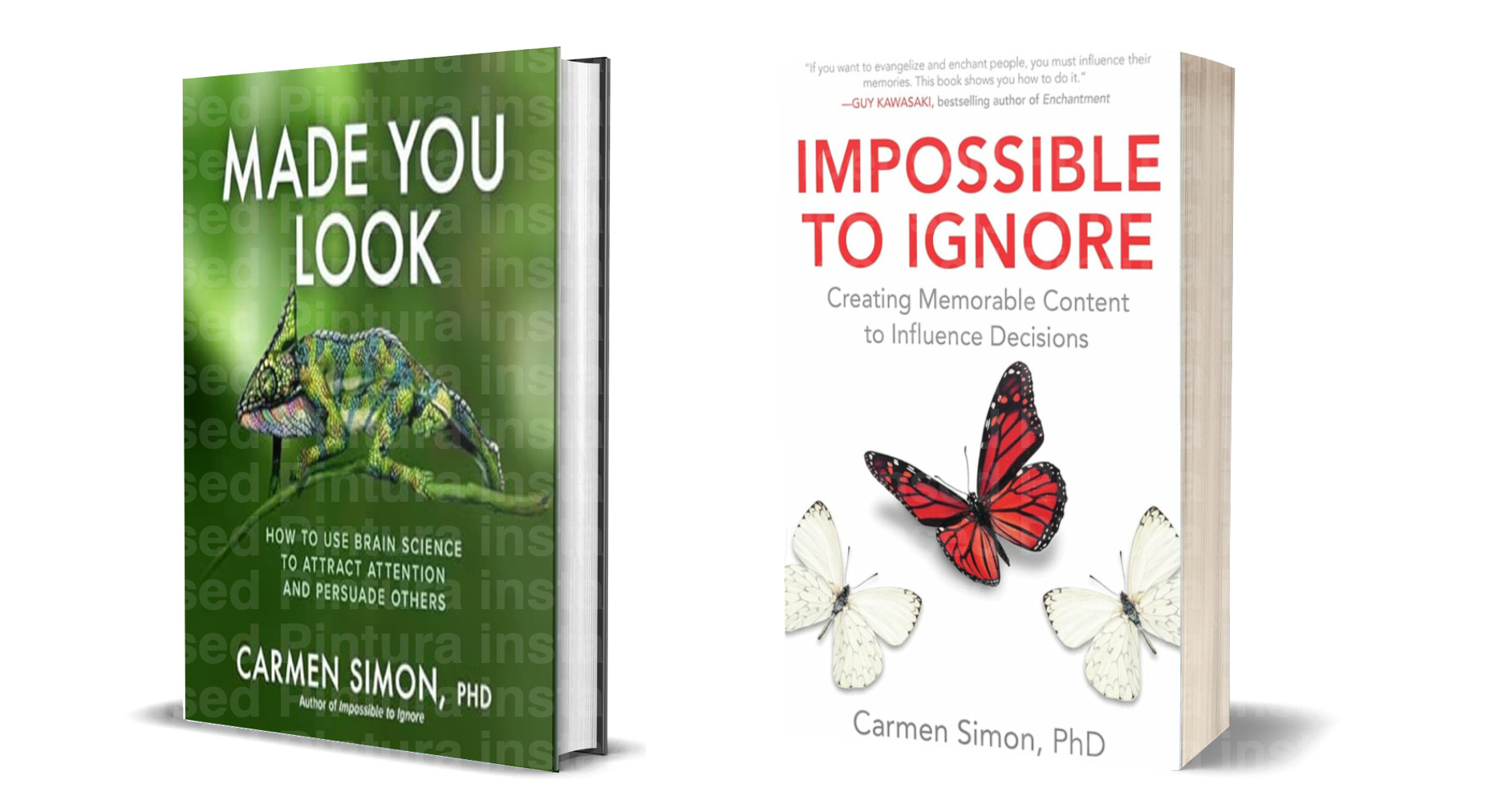
Carmen Simon comes from a different world. A cognitive neuroscientist, she studies attention, memory, and decision-making, asking what people notice, what they remember, and what ultimately changes their minds. Books on my bookshelf authored by Simon include, Impossible to Ignore: Creating Memorable Content to Influence Decisions, and Made You Look: How to Use Brain Science to Attract Attention and Persuade Others.
To be clear, neither of these experts’ books contained advice about AI presentation tools. Instead, Tufte asks whether the presentation makes important relationships visible. Simon asks whether the presentation directs attention to what matters.
Those ideas gave me a different way to look at the slide deck AI produced. The deck generated resembled thousands of presentations I'd seen before, but I’m fairly sure the deck hadn’t been designed to help audiences understand any of the ideas contained in it.
AI-powered presentation generators have learned the patterns found in millions of previously published slide decks. That doesn’t mean they’ve learned which presentation choices actually help people understand information. This observation became more obvious after a small experiment.
What Happens When AI Tries To Communicate Ideas?
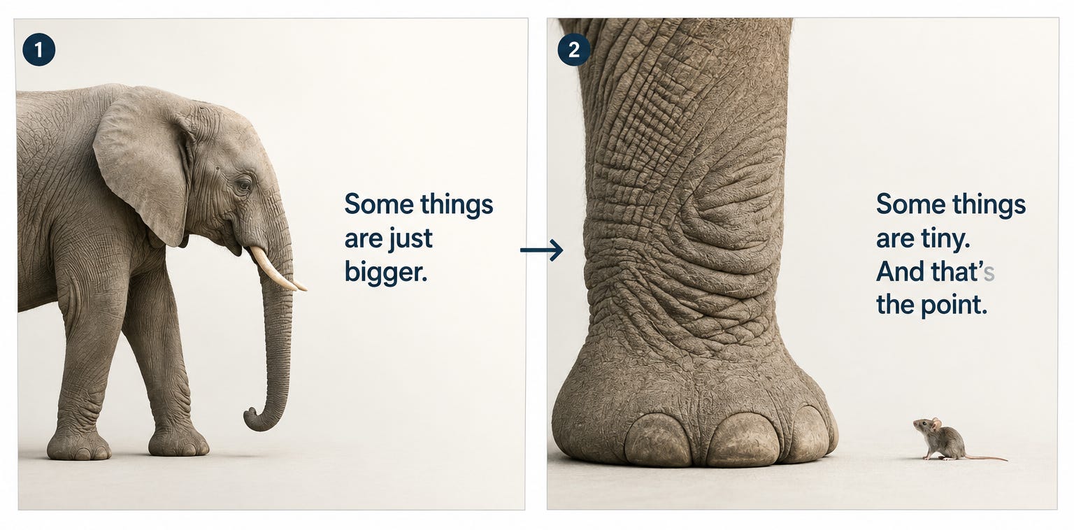
Simon uses a comparative visualization (like an elephant standing next to a mouse) to communicate an enormous difference in size. It’s a simple example because everyone already understands the comparison before the speaker explains it.


Curious what AI would do, I asked an image generator component of ChatGPT for the same scene. The elephant looked terrific. The mouse, however, came back looking like a mouse, but much too large.
The image generator produced a balanced, attractive image, but it appears to have solved a different problem than the one I was trying to address. Simon's example isn't really about creating an attractive image. It's about making the difference in size immediately obvious, as in the image below.
Edward Tufte made a similar point years before generative AI existed. In The Cognitive Style of PowerPoint (eBook), he argued that presentation software often encourages people to reduce complicated ideas to outlines and bullet hierarchies, writing that:
“PowerPoint routinely disrupts, dominates, and trivializes content.”
His criticism wasn’t about the Microsoft app. It was about what happens when presentation conventions become more important than the relationships we’re trying to explain.
That may also explain why so many AI-generated slide decks feel strangely familiar.
We sometimes criticize AI-generated presentations for looking too much like PowerPoint. In reality, PowerPoint may have been teaching AI how to make presentations. If we don’t like some of the AI-generated results, we should probably spend at least a little time looking in the mirror.
What Can Tech Writers Learn From This?
None of this feels particularly foreign to tech comm pros because we’ve been making communication decisions for years. We decide whether something belongs in a table instead of a paragraph, whether a diagram will explain the idea faster than prose, whether the warning belongs before the procedure instead of after it, and whether two ideas should be compared side-by-side rather than described one-after-the-other.
Those aren’t formatting choices. They’re communication choices.
AI presentation tools appear to recognize presentation patterns more readily than communication objectives. That's why human review still matters. Someone needs to decide whether each slide helps the audience notice, compare, understand, or remember what matters.
Can Better Prompts Produce Better Slide Deck Presentations?
One thing surprised me while experimenting with these tools. Changing the prompt often had more impact than changing the AI-powered presentation generating software.
Asking Google Gemini for a:
“presentation slide deck about structured content aimed at tech writers”
produced a perfectly ordinary deck (below).
Asking the system to:
“help tech writers understand why AI produces better answers when information is well structured”
changed the character of the presentation because the prompt described the audience and the communication objective instead of just the topic.
I altered the prompt to provide additional instruction and context:
“Design a presentation that introduces technical writers as “context designers” for an audience of technical communicators and documentation leaders.
Apply communication principles derived from the work of Edward Tufte and Carmen Simon rather than simply reproducing common presentation styles.
For each slide:
👉🏾 Define a single communication objective before selecting any visuals.
👉🏾 Use images only when they help the audience understand, remember, or compare an idea more effectively than text alone.
👉🏾 Prefer visual comparisons, juxtaposition, scale, process, or cause-and-effect relationships over decorative illustrations or generic stock photography.
👉🏾 When appropriate, deliberately sacrifice visual symmetry or aesthetic balance if doing so makes the intended relationship easier to perceive.
👉🏾 Keep text concise and allow the visual to carry as much of the explanation as possible.
The presentation should compare the traditional technical writer role with the emerging role of the context designer. Show how responsibilities shift from producing documentation to designing the information environment that enables AI systems and humans to retrieve, interpret, and apply knowledge correctly.
For each slide, provide:
👉🏾 the communication objective
👉🏾 the key message
👉🏾 the recommended visual
👉🏾 why that visual supports comprehension according to the communication principles being applied
👉🏾 the accompanying slide textDo not optimize for attractive slides. Optimize for rapid comprehension and long-term recall.”
That makes me wonder whether prompt engineering will gradually become less about describing deliverables and more about describing communication objectives.
Hmmm…
How Should We Evaluate AI-Generated Presentations?
Most reviews of AI presentation tools focus on how quickly they generate slides or how polished those slides look. Those don’t seem to be the questions that matter most. I’d rather know whether the presentation makes important relationships obvious, directs attention where it belongs, and leaves the audience understanding something they didn’t understand before they walked into the room.
I’m putting together a simple evaluation framework based on Tufte’s work on information design and Simon’s research into attention and decision-making. The plan is straightforward: generate the same presentation with several AI presentation tools, score each deck against the same criteria, and see what happens.
I honestly don’t know which system will perform best. That’s exactly what makes the experiment worth running.
We’ve spent years thinking about clarity, comparison, emphasis, and understanding. AI hasn’t made those questions less important. If anything, it has given us another reason to ask them. 🤠
If you provide the presentation AI with structured notes, its more likely to produce something visual ... at least with Gamma, which is basically a markdown document turned into slides (and several structured layouts available). So if the structure of the note matches one of these structures, the result is much better.
So typically I compose a master prompt on top of my structured knowledge base, then transfer that over to AI, instead of just prompting inside the tool.