The Beginner’s Guide to Microcopy
Four tips for writing great microcopy to increase your bottom line
by Kinneret Yifrah
Which sign would you prefer to find on the coffee machine when you get to the office in the morning?
This one:
Or this one:
This isn’t precisely microcopy because it’s not a digital product—it’s a paper sign. But the difference between the two signs is the essence of microcopy. These words can be disappointing and frustrating, but the correct phrasing can make the connection with our users more human, clear, motivating, and enjoyable.
Microcopy is…
The words and phrases in a digital product that guide user action. By digital products, I mean websites and apps, of course, but also complex systems, professional systems, and digital kiosks, such as ATMs.
Microcopy comes:
Before the action, to motivate users to act, like in CTAs and onboarding.
During the action, like hints, tooltips, control labels, buttons, and menus.
After the action, like an error message if something went wrong or a success message if the action was completed as intended.
Let’s go through four microcopy guidelines — human, clear, motivating, and enjoyable — and see how better microcopy can benefit every business.
1. Be human: Use conversational writing
Why should machines sound human, you ask? I strongly recommend reading The Man Who Lied to His Laptop by Clifford Nass and Corina Yen. Nass, a professor at Stanford University, conducted 100 experiments to study the connection between human users and digital UIs.
One of his most interesting findings was that human users expect digital products to act according to human social norms. Humans are put off or even offended when a digital product fails to do that. They can walk away angry with a UI that sounds like a machine instead of a human.
To sound human, we need to go a few years back. Not so long ago, we had a very clear distinction between the language we used for writing, which was formal and complex, and the language we used for talking, which was much more dynamic, short, and flowing.
But the internet changed everything. On the internet, we write words, but it looks more like a conversation than formal written correspondence.
Erika Hall sums it up in Conversational Design by stating that technology breaks down the traditional categories of writing vs. talking and creates a third option: conversational writing.
For example, it’s okay to write, “Please choose the preferred payment method.” But if I imagine a user standing before me, I would just say, “How would you like to pay?”
The first sentence is longer and uses words we don’t usually say, like “preferred” and “method.” The second sentence is shorter, flows better, and sounds like two people conversing. This is precisely what we aim for.
The screenshot below is from the Pinterest app. They don’t say, “Please allow Pinterest to access your camera,” but instead phrase it as a super simple and less intimidating question:
This is Gmail introducing a new feature:
Users can easily understand what that feature does and how it can help them. This is what conversational writing does.
The next one is from Microsoft Office. Those who are not Apple people have probably noticed the massive change in Microsoft’s language over the past couple of years, from technical and formal to conversational. This is a great example:
2. Make everything clear: Answer questions in advance and spot possible concerns
Designers and users share the same goal: We want users to complete the action successfully, whether downloading, trying a demo, submitting a form, registering, or buying. We want users to get to the finish line as quickly and efficiently as possible.
To achieve that, we need to identify and anticipate potential friction points where users could get stuck or even quit the product altogether. We need to step into our users’ shoes and go through the product to ask:
What might users misunderstand or not know how to do?
What might make users concerned or suspicious?
What will lead users to call support or give up?
Once we answer these questions, we can address our concerns in advance, thus helping users continue smoothly and increasing completion rates.
In a talk she gave at InVision, Sara Walsh shows how Capital One doubled the number of words in a form on their website, giving up white space and adding assistive copy around the fields to answer users’ questions and instruct them. This tripled the form completion rate from 26% to 92%.
Let’s see a few examples of common friction points and how to deal with them.
Friction point #1: “What does that mean?”
Nearly every industry has specific terms that outsiders will not understand. This one is from The Noun Project icon store:
They answered the question — a definition for each license — in a tooltip, so users don’t have to Google it or otherwise leave the product.
Friction point #2: “What does that do?”
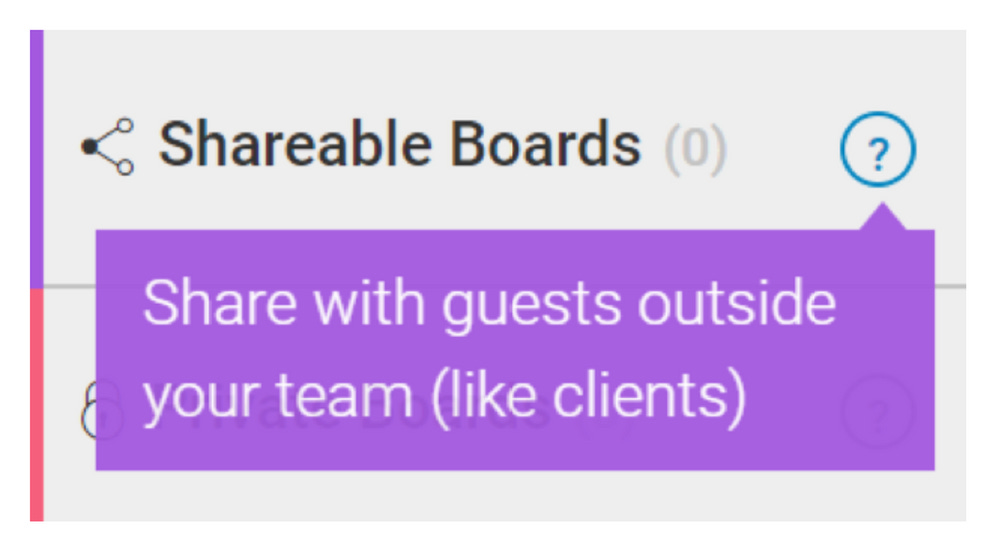
This is from Monday, the team management tool. When we name the different features in our product, we create a unique convention, and new users might not understand it. We need to explain what that name means and what the feature does. Monday does a great job using colorful Tooltips:
Friction point #3: “Where do I get that information?”
This is from HP. When they ask you to enter the name or number of the product you want to register, they also give you a link that answers what you’re probably asking—how to find this information. When you click on it, you get the answer with an image that clarifies everything:
Friction point #4: “What format?”
This is from a form connecting a bank account with a PayPal account. PayPal gives the user a hint about the correct format (two digits, no spaces) and suggests where to get the information. This helps the user complete the form without getting any frustrating error messages along the way:
Friction point #5: “Why do you ask for these personal details?”
When we ask users for their personal information, like birth date or phone number, they’re concerned about their privacy and want to know why we need this information. This is also from Monday:
Friction point #6: “Is the free trial free?”
Users' main concern when they consider whether to activate a free trial is that as soon as it expires, we’ll start charging them. So Spotify, like many others, addresses this concern by stating upfront that there is no credit card needed during the registration process, which means we can’t charge you when the free trial expires:
There are many more questions and concerns depending on the product and the industry, so go over your product, identify these weak points, and address them in advance using microcopy.
3. Motivate users to act: Open the door and give them a good reason to step in
Every digital product has many micro-actions unrelated to selling that we want users to take. For example:
Allow access to contacts, location, camera
Add to calendar
Rate us
Give cookie consent
Remove ad blocker
Try a new feature
Sign up for our mailing list
Fill a profile
Contact us
Start a conversation
Share with friends
Run another search
To motivate users to take these micro-actions and increase in-product traffic, we use a basic marketing principle:
If we want someone to do something, we need to give them a good reason to do it and tell them how they will benefit.
Don’t talk about yourself or your product; talk about them.
For example, if we want users to share our product with friends, it will not help to tell them how sharing it will help the product grow. Most users are not interested in helping us grow our product. The Infatuation is a restaurant recommendation website. When they want users to spread the word, they don’t talk about how great their product is. Instead, they say:
In other words, your friends will thank you and love you more if you share The Infatuation. Friends’ love is something people care about and are willing to act for.
If we want users to sign up for a newsletter, it’s not enough to write, “Sign up for our newsletter” because that doesn’t specify what’s in it for them. This example is from Good UI, which is saying, “We do all the work; you get the results to learn from.” The value proposition is clear:
This is Medium’s joining page. Medium wants users to create accounts, so they tell them how it will improve their experience:
Medium’s users need these features to get the most out of the platform. Another way to increase in-product traffic is to make sure we have no dead ends but instead present the next step or give an alternative.
Based on Quettra’s data, the average app loses 77% of its daily active users within the first three days of installing it. Within 30 days, it loses 90%. One of the reasons, according to Dina Chaiffetz, is the first impression, in which empty states are not educating, delighting, or motivating.
For example, a shopping cart can potentially be a static dead end like this one:
But look how Society6 turned that dead end into an open door:
Look at this website with a vast collection of empty states for inspiration.
4. Create an enjoyable journey: Make users feel good
There’s a common misconception that microcopy should always be cool and funny. Well, that’s a mistake. Most of the time, microcopy is quite serious. As we saw in the other guidelines, microcopy aims to help users, answer their questions, and motivate them, not amuse them. So if the brand and product are not meant to be funny, forcing it will sound and feel unnatural, and your users will pick up on it.
But humor is our best friend if the brand’s voice and tone are spiced up with a bit of joy and fun. Professor Nass found that when we make users smile, we make them feel better about themselves, love the brand more, and are more willing to act because they’re energized.
So how do we make users feel good?
This is from a website called Imperfect Produce. They sell fruits and vegetables that people don’t want to buy because they look, well, ugly. What’s more appropriate for a welcoming page than saying this?
This image, by the way, is from the Facebook group Microcopy & UX Writing. This is an international group, and if you are interested in microcopy, check it out.
Professor Nass found that compliments like these are effective and make users feel good about themselves even though they know they’re not real. We are strange creatures, so go ahead and be generous with compliments. (And take it as a tip for life, too.)
If users are upset, cheer them up. This is from Duolingo:
When they’re happy, celebrate with them:
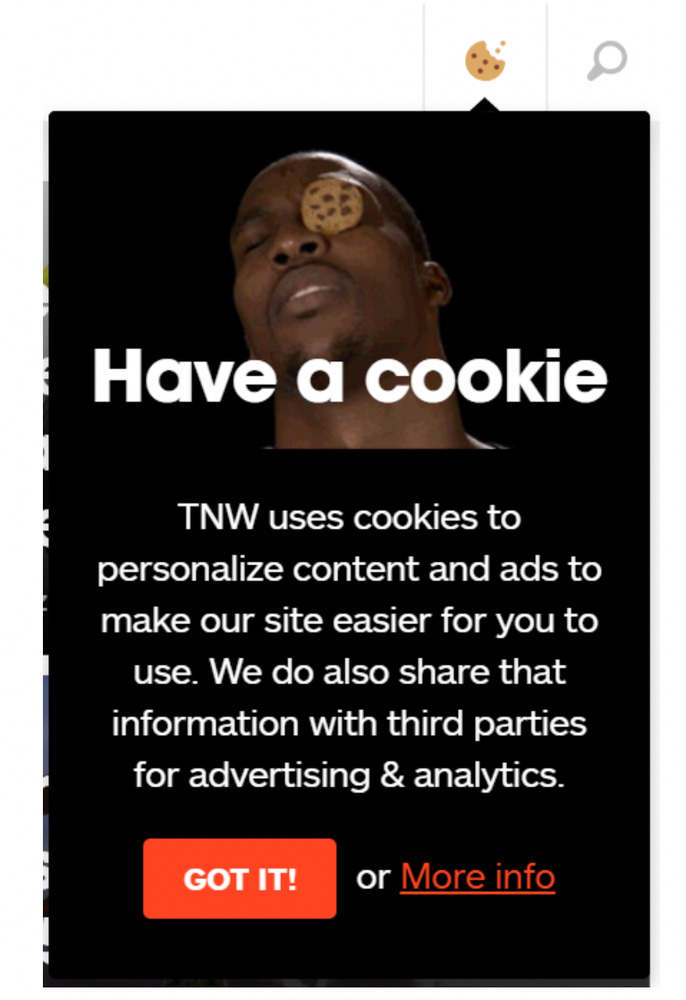
This is The Next Web asking for cookie consent. The combination of the image and the copy is a winner:
Error messages can also be funny, but we must be careful because they should always be clear and helpful.
If you enter your age as over 122 on OurHome app, you get this hilarious error message:
These four guidelines are very user-centered. But what about the business side? What’s microcopy’s return on investment (ROI)? How can every business benefit from having better microscopy?
The ROI of microcopy
1. Better microcopy gives users fewer reasons to leave. They understand the product or site better because we’ve stated everything in conversational language and addressed questions and concerns in advance.
2. At the same time, they have more reasons to act because we show them the product's benefits, open doors, and make them feel good about themselves and us. If fewer people leave and more people act, this leads to more users that successfully complete the desired action—with a smile on their faces.


