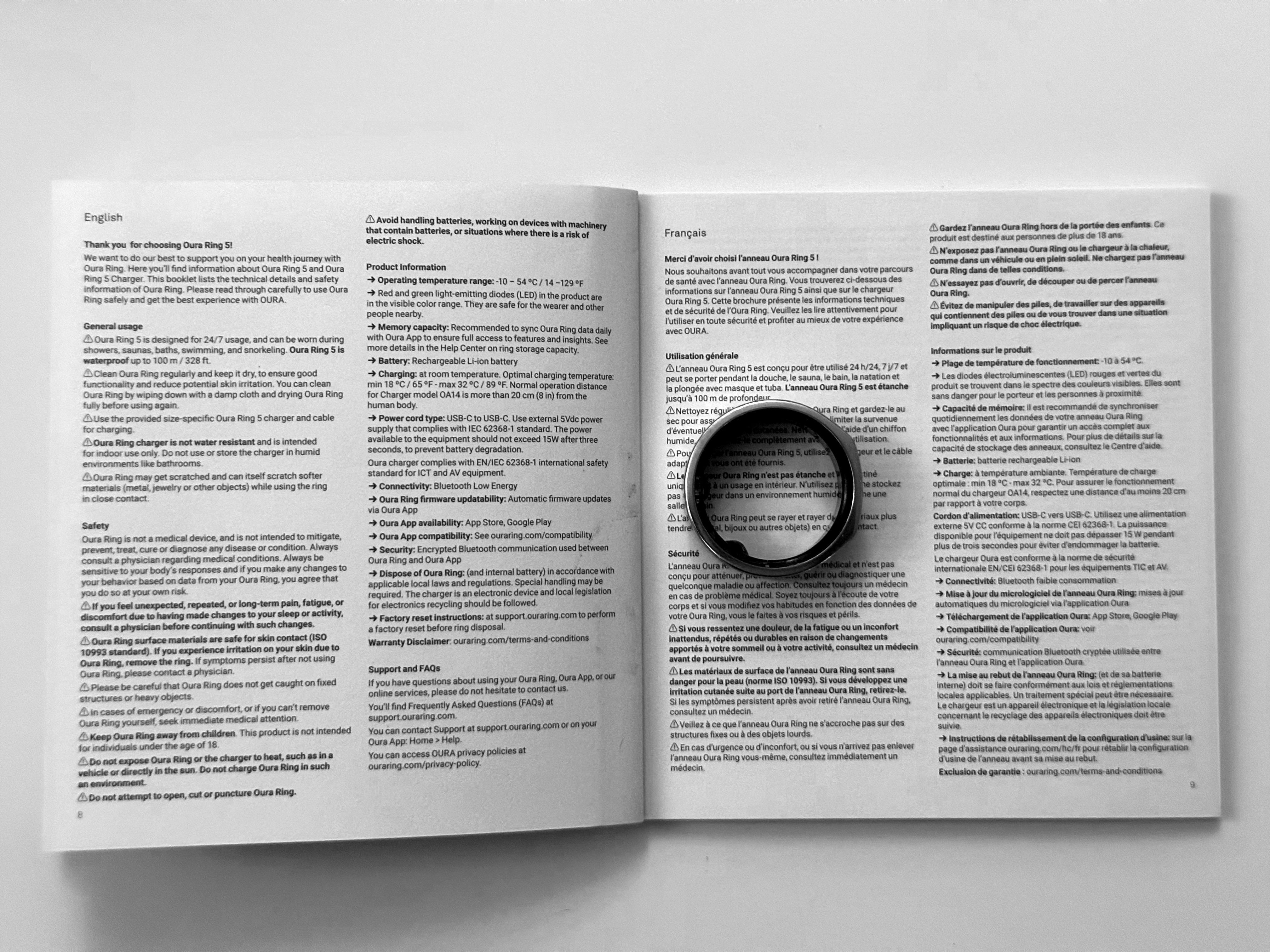
I recently upgraded to the Oura Ring 5. It arrived in an elegant, Apple-style box with a printed getting-started booklet inside. I am 62 years old, my vision is less than stellar, and I rely on prescription eyeglasses to read small type. I put mine on, opened the booklet, and still couldn’t make out what it said.
The type was so small that I had to devise a workaround. I photographed the pages with my iPhone and enlarged the images until the text became legible. The Oura Ring 5 getting started guide warns about skin irritation, battery charging, overheating, electrical safety, and injury if the ring catches on an object, and it states the product’s medical limitations, amongst other things.
My estimate is that the type they used is around 4 to 5 points in size. That is too small for me to read and well below the 12- or 14-point sizes that consumer-instruction and accessibility guidance recommend.
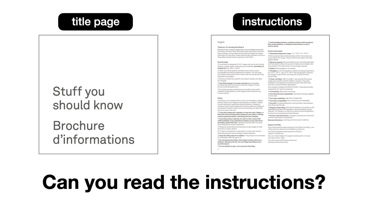
Oura didn’t forget to include warnings. The cover of that getting started document tells readers there’s valuable info inside. The title — “Stuff you should know” — screams it loudly in large type (in both English and French).
Someone at Oura wrote that stuff. And perhaps more telling, someone at Oura approved printing that same stuff at a size I couldn’t read without magnification.
One thing is clear: There’s something wrong with that stuff.
If This Info Is Online, Why Does Print Size Matter?
Some readers will say the booklet’s available online, where anyone can enlarge the content. That’s true: Oura’s help center hosts a PDF of it. But that helps only those who figure out where to find it and how to enlarge it (tasks they should not have to perform in a so-called “frictionless” experience.
And, it doesn’t make the printed getting started guide Oura provided in the product package any easier for customers to read.
The guide is provided to customers inside the box, and it tells customers who can actually see the text (despite it’s teeny tiny text size) to ”read through it carefully to use the ring safely and get the best experience”, in the same tiny font size.
While using the Oura help site I also discovered that the printed getting started guide omits some important safety instructions that Oura does include online.
Oura’s Product Safety & Use article tells customers to:
seek immediate medical attention if a child swallows the ring, and to
stop trying to remove a stuck ring if the finger is very painful, swollen, or discolored
It also advises against:
scuba diving with the ring, or
keeping it underwater for more than twelve hours
I didn’t find any of this safety information in the booklet’s English safety section; even with the help of a magnifying glass 🔍. So, inconsistent messaging is also a problem between the print and online product info.
That’s fodder for another blog post.